Shades of Equality
Creatively activating equality through data and color
The Shades of Equality are data-informed colors that each tell a story about equality.
We developed each color in CMYK with gender-related data in mind. For example, Literacy Blue - the shade of blue you see all over this website - is 89.9% cyan, 83.1% magenta, 0 yellow and 9% black. It tells the story of how, globally, 89.9% of men are literate, 83.1% of women are literate, and by age 9, boys in the United States are reading a full grade level below girls. Literacy and access to education is a gendered issue around the world.
In this spirit, every color in the Shades of Equality tells to gender equality, equity, and inclusion.
We give visual identity to important issues in an innovative way. Hopefully, over time, we’ll see these colors get lighter or darker, as we make progress towards the gender-equal and inclusive world that we collectively hope to live in. In the meantime, we hope you’ll also use these colors to spark engaging, meaningful conversations that address the root and last mile of gender equality and inclusion (beliefs and behaviors).
Our goal for the Shades of Equality is to inspire, spark conversation, and create impact in homes, classrooms, workplaces, and public spaces all around the world.


Climate Palette

Economic Equality Palette
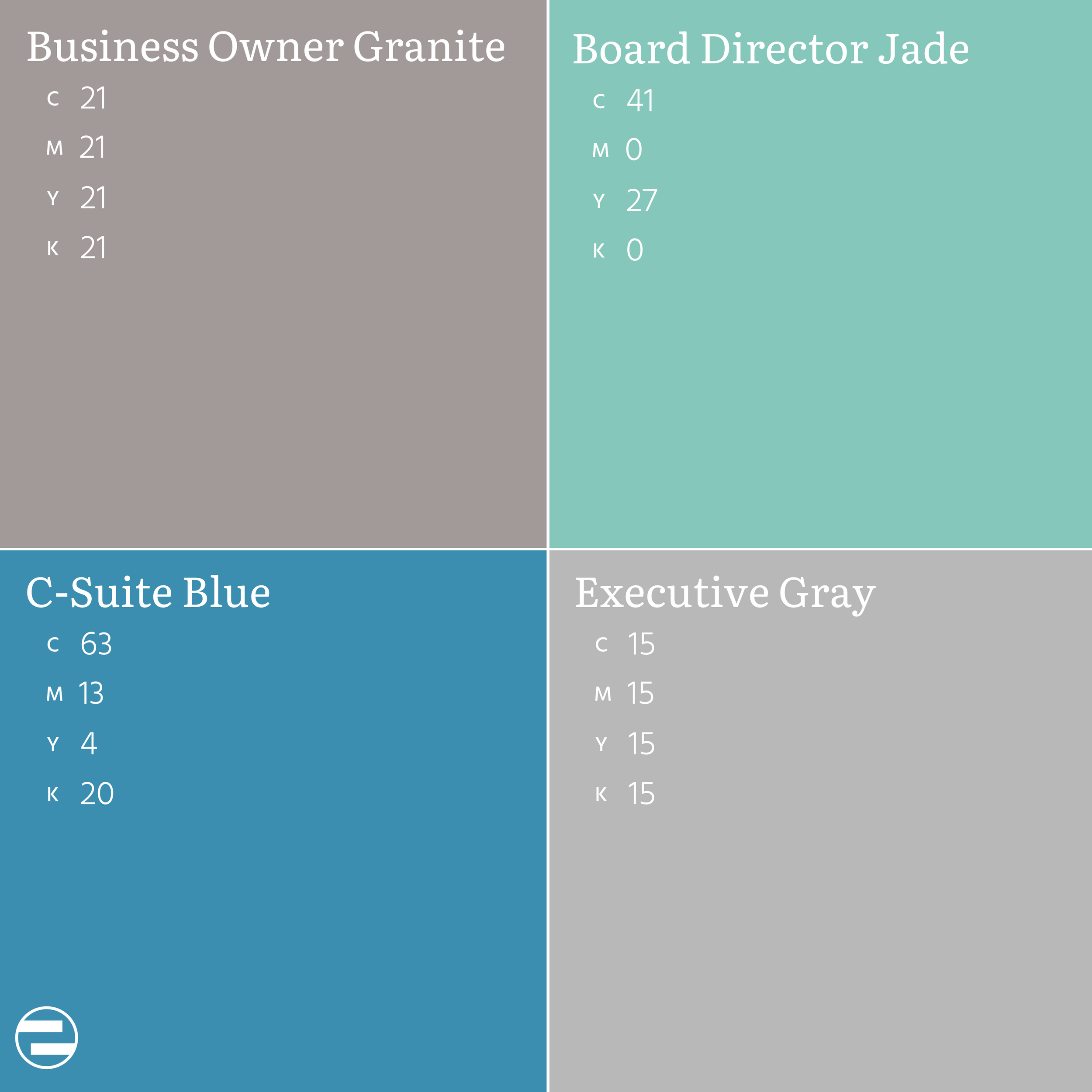
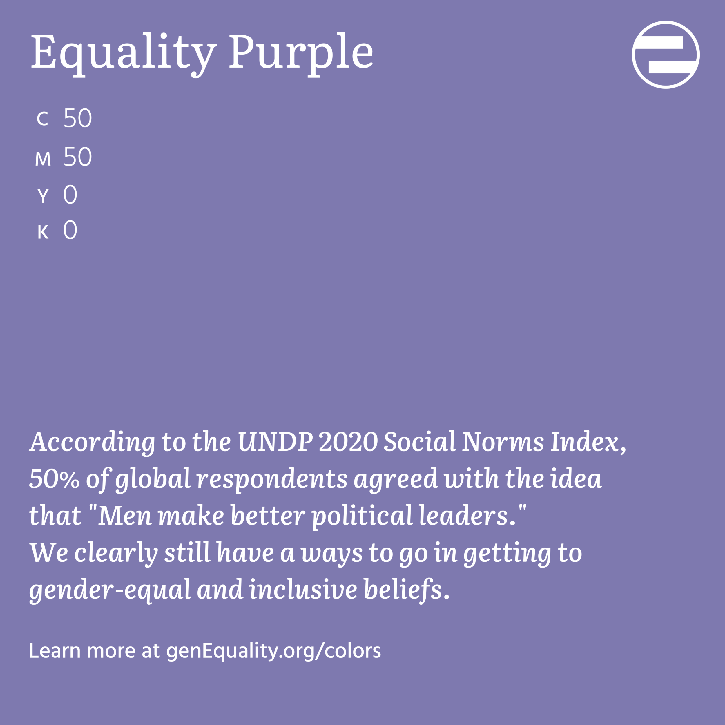
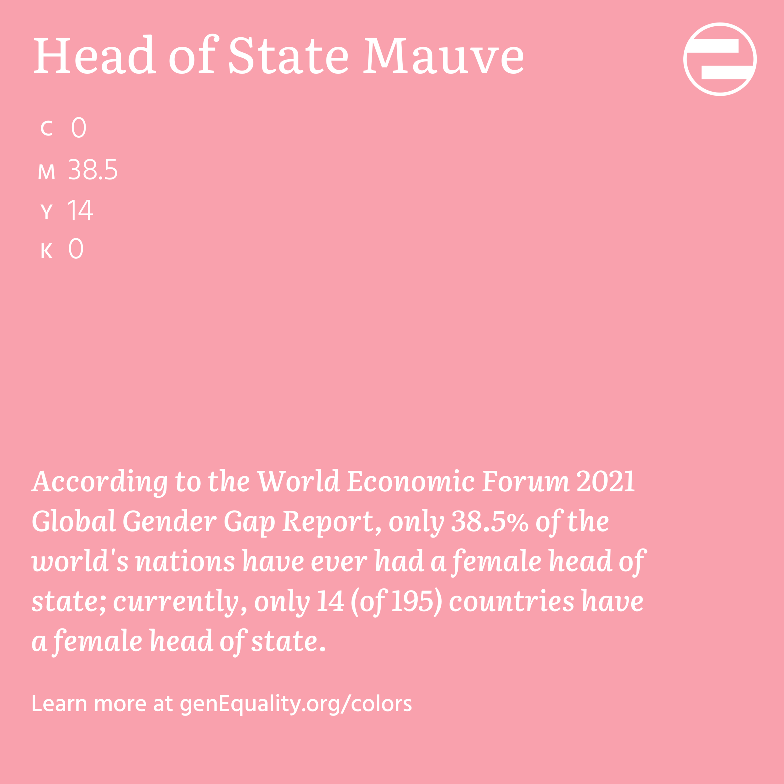
Public Life & Leadership Palette

Communications Palette

Health Palette

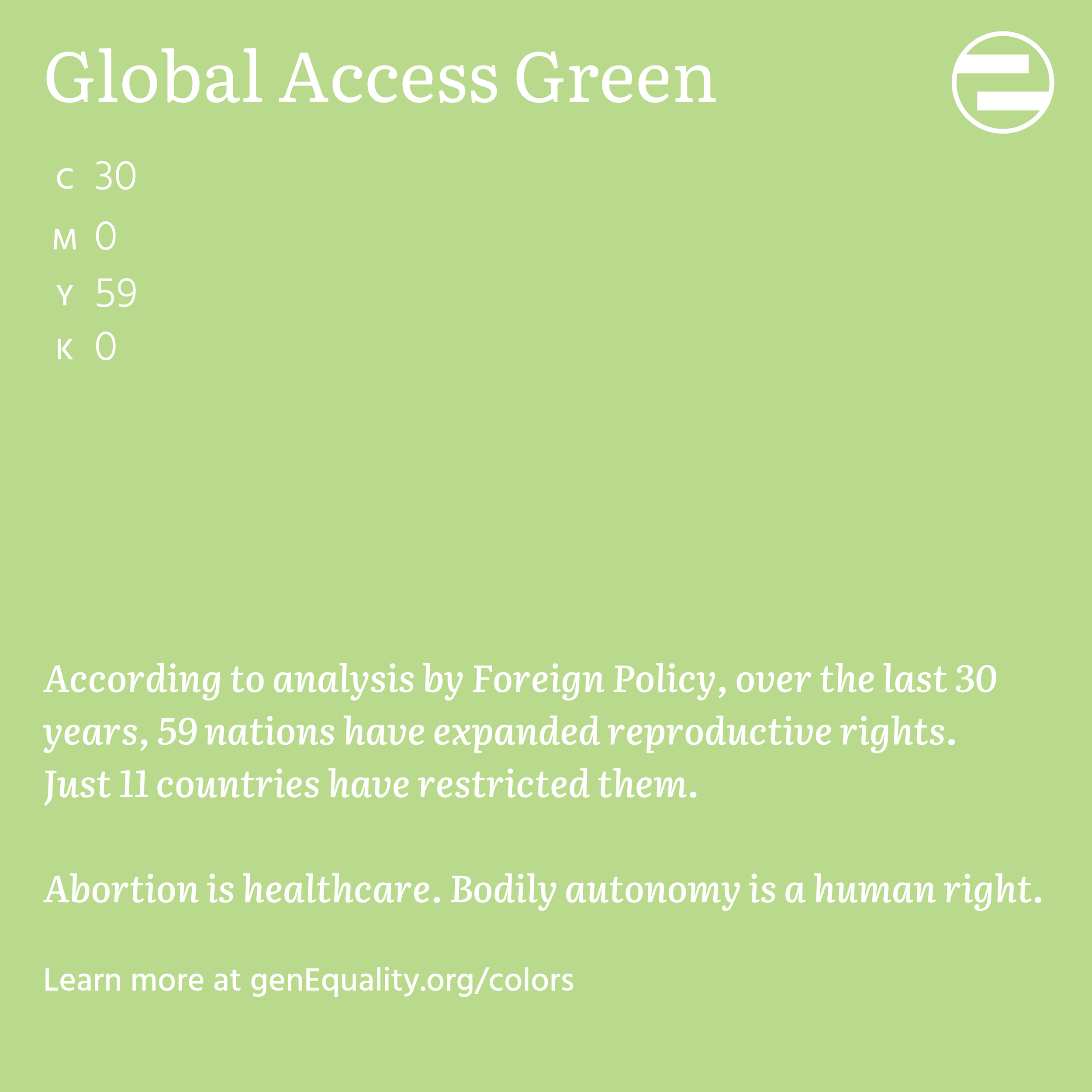
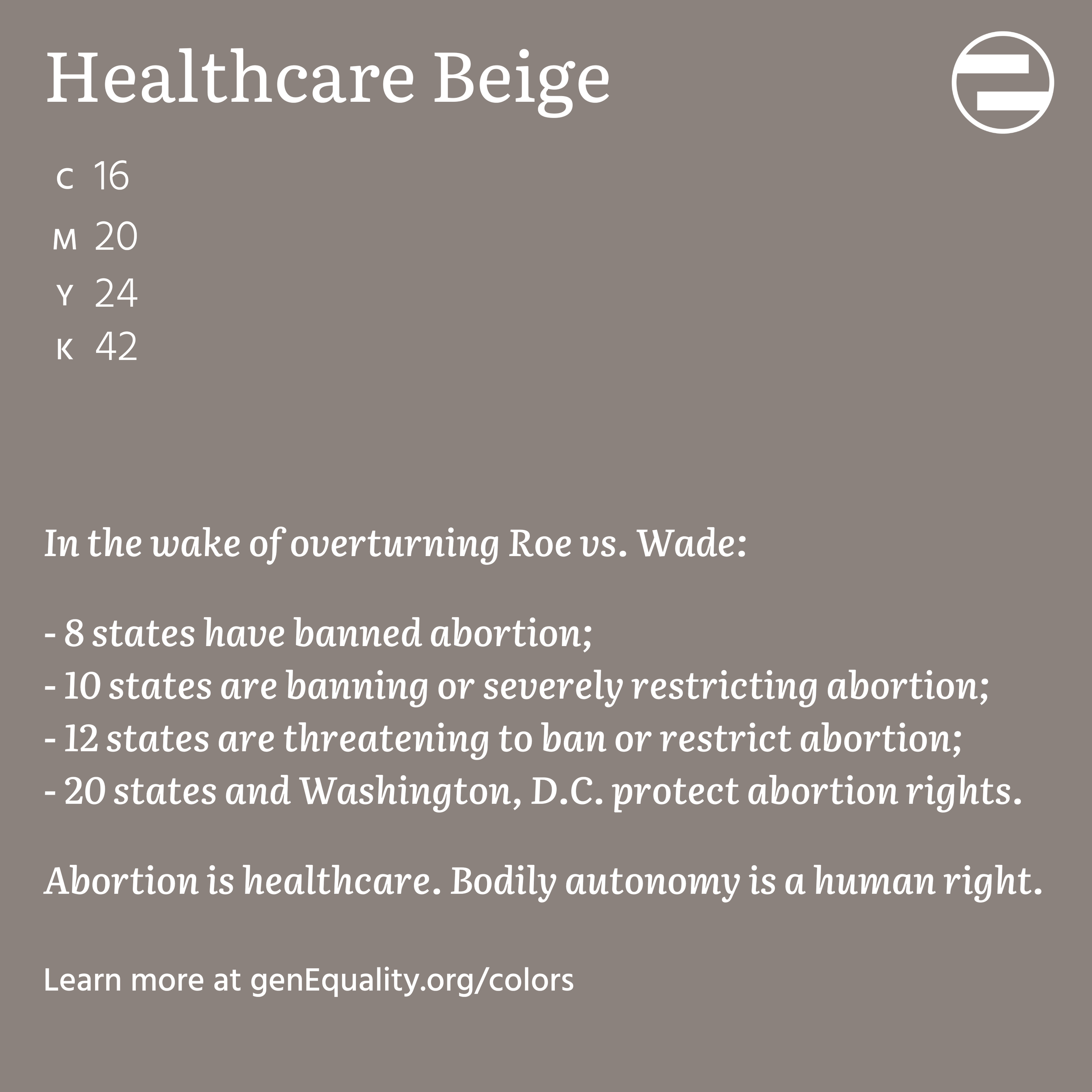
Reproductive Rights Palette

Social Norms & Cues Palette

Sports Palette

Wage Gap Palette

Colors don't have gender, but our colors do have gender data - and they bring a deeper level of purpose into the impact that we co-create in classrooms, companies, and communities.
If you want to use one or some of our Shades of Equality in your artwork, your organization’s print materials, a customized paint color for your home, or other creative uses, we're happy to provide support and guidance for their use.
How the Shades Came About
From the beginning, genEquality has approached the work of gender equality in a creative, research-driven, interactive way. In our rebranding process, we thought about how the brand system in itself can become an active participant in our organization’s mission. We spent a lot of time thinking about our brand colors, searching for shades that captured our purpose and created a sense of connection to our work.
Over months of brainstorming sessions, we created something even more meaningful than our primary brand colors: we created a set of data-driven colors that tell a story about equality. We give visual identity to important issues in an innovative way. And hopefully, over time, we’ll see these colors get lighter or darker, as we make progress towards the gender-equal and inclusive world that we collectively hope to live in.