Our Brand
An organization’s brand is a storytelling opportunity. In our early rebranding conversations, we asked ourselves: Could our brand system not just tell a story, but also become an active participant in the organization's mission? In what ways might our brand elements activate people towards gender-equal, inclusive beliefs and behaviors?
From the beginning, genEquality has approached the work of gender equality in a creative, research-driven, interactive way. As we approached our fifth anniversary, we saw an opportunity not just to update our brand, but to imbue it with our mission, our values, our ethos, and our approach. Our new visual identity embeds equality and inclusion from the smallest brand molecule, all the way up.
Our activations, Nudge Art, and programs have always meant to be conversation starters. Now, we hope our brand elements will be conversation starters, too. We spent a lot of time thinking about each part of our identity - from the elements of our logo, to how our font choices could advance equity, to what colors we used and what the colors themselves could say.
A Font Is More Than Just Letters

Since a big part of what we say is how we say it, we started by thinking about our fonts quite a bit. It also helped that our creative director, Lisa, has a general fondness for fonts.
While women make up more than half of the design workforce, typography appears to be a particularly male-dominated area of the design industry. It’s been suggested that type design’s roots in the historically male-dominated world of printing has resulted in today’s gender disparities; as of 2019, only 24.6% of Rentafont's fonts were designed by female designers. So we started looking for fonts that not only spoke to our mission of equality and inclusion, but also amplified the work of female typographers.
Our new fonts are Literata (serif) and Hind (sans serif). You can see both in action in our mission statement (see image, right). Both fonts were designed with equality and inclusion in mind, and created/led by female designers. If you're interested in more of the details about the designers and details of our fonts, check out this blogpost.
Not only are we committed to shedding light on a correctable disparity, but from now on, our every word will be imbued with the values of equality and inclusion, via fonts designed by women-led typography teams and designers.
Our Logo & Symbol
Logo Updates
Once we decided on our new fonts, we began re-examining our logo. You might notice that the new logo is in the inclusively-designed Hind font! The "gen" in our name calls in ideas of gender, generation, and generate, and is now outlined to make space for its multiple meanings. Before, the 'gen' and 'equality' were different in both case and emphasis for readability, but now, the two are equal - with an uppercase E to enhance readability.
Here is a comparison of our old and new logo, along with an annotation of our logo update:
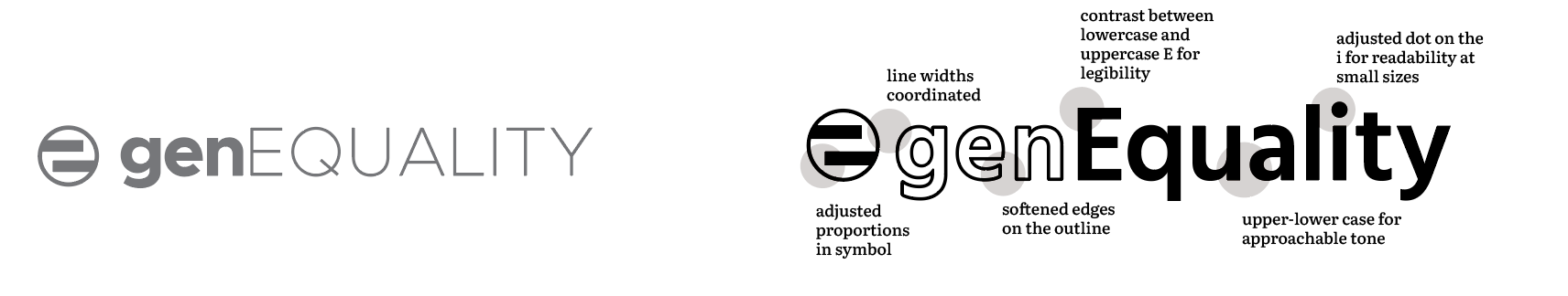

The genEquality Symbol
We also updated the genEquality symbol so that it's coordinated with the rest of the logo, but didn't change it. When we first created the genEquality symbol, we aimed for three core qualities: 1) simple, 2) scalable, and 3) significant. We wanted a symbol that anyone could draw; that could print on everything from small pens to big framed art; and most importantly, that would signify what we do.
What does the symbol signify?
Our symbol draws from the traditional equal sign, but is offset to signify that we still have a ways to go towards equality. It's set in a circle to invoke the gender symbols, which all contain circles, while also nodding to the global nature of gender inequality and the efforts to make change.
Colors That Start A Conversation
Last but not least...we spent a lot of time thinking about colors, and we're so excited about what came of it. Our original brand colors were colors without stereotypical gender association: purple, green, gray, black and white. In rebranding, we searched for shades that captured our purpose and created a sense of connection to our work. Over weeks of brainstorming, we created something far more meaningful than just primary brand colors: we created more than 20 data-driven colors that tell a story about equality. If you're interested, you can read more about our color creation process on our blog.
We're so pleased to share our new primary brand colors below, each of which is informed by gender data and tells a story of equality and inclusion:

How does color offer an opportunity for meaning in genEquality’s brand?
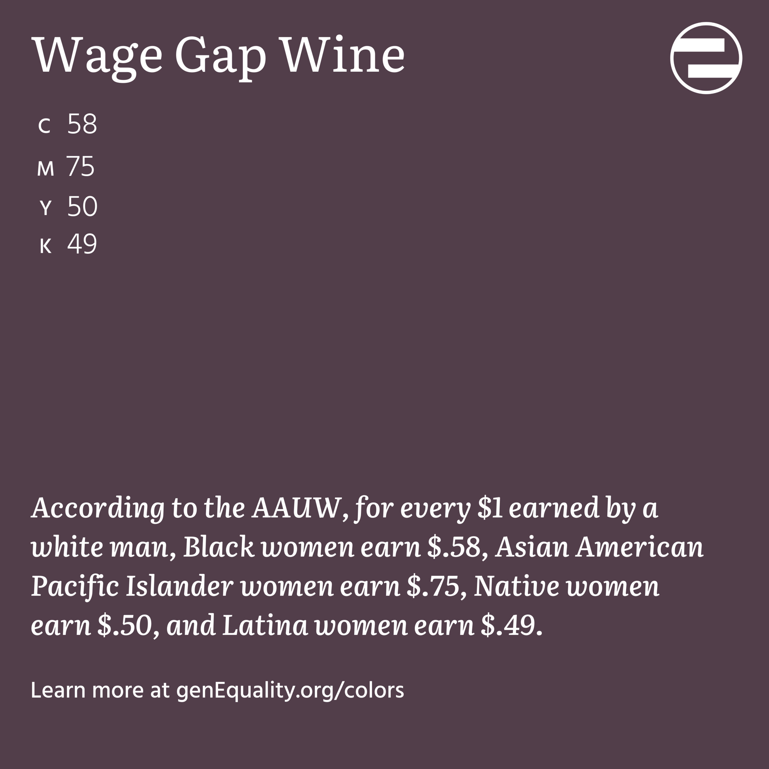
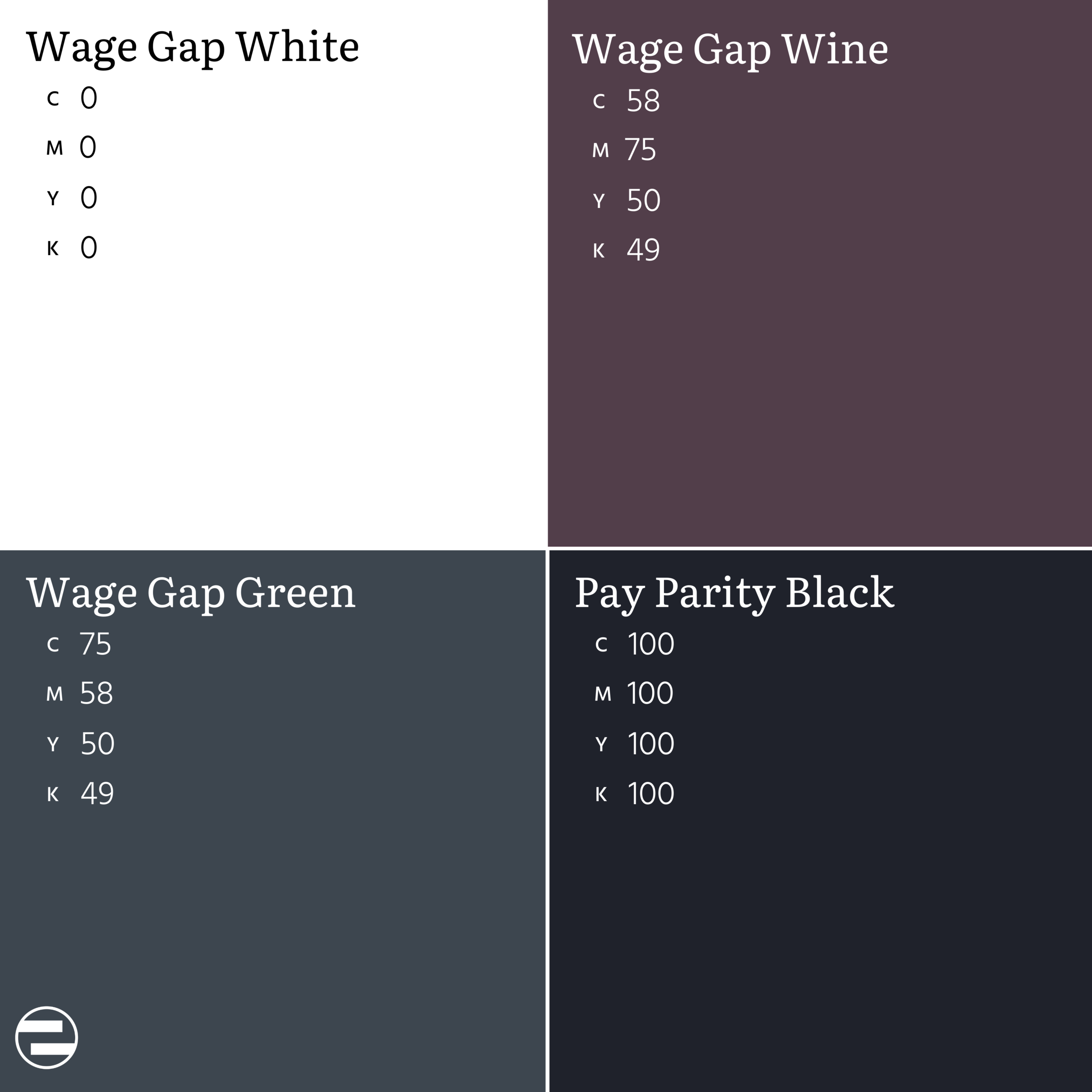
We developed each color in CMYK with gender-related data in mind. For example, Literacy Blue - the shade of blue you see in reading our website - is 89.9% cyan, 83.1% magenta, 0 yellow and 9% black. It tells the story of how, globally, 89.9% of men are literate, 83.1% of women are literate, and by age 9, boys in the United States are reading a full grade level below girls. Literacy and access to education is a gendered issue around the world. In this spirit, every color in the brand system connects directly to gender equality and inclusion.
See some examples of individual color cards, as well as our categorized color palettes, below:


Color Palettes by Activation Category
Communications Color Palette

Public Life & Leadership Color Palette

Economic Equality Color Palette

Social Norms & Cues Color Palette

Wage Gap Color Palette
If you’re interested in using any of the data-driven colors or color palettes that we developed, we’d love to see it!
We want see these colors out in the world and hope they’ll create impact far beyond our organization’s reach alone.
If you want to use them in your organization, your print materials, or even for a customized paint color for your home…please reach out to us, and our team will happily share the necessary CMYK/RBG information with you.